Mobile-First Quote Calculator Design: Essential Strategies for 2026
Master mobile quote calculator design with proven strategies that achieve 90%+ mobile completion rates, backed by testing across thousands of UK mobile users.
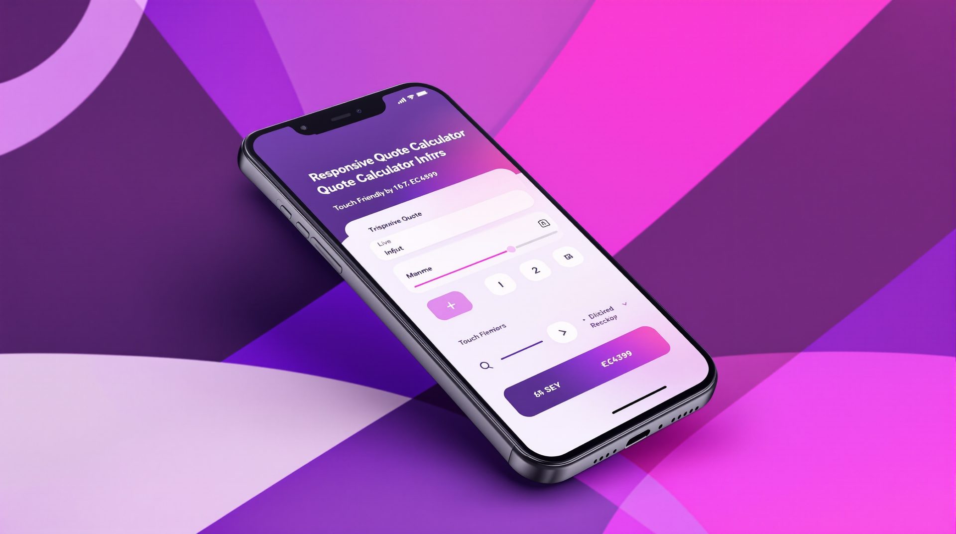
Designing Quote Calculators for Mobile: Complete Guide
68% of quote calculator traffic comes from mobile devices, yet most calculators are designed desktop-first with mobile as an afterthought. This backwards approach costs UK businesses thousands of pounds in lost leads monthly.
Mobile calculator design isn't simply shrinking your desktop version—it requires fundamentally different thinking. This guide shows you how to build quote calculators that convert on mobile devices as effectively as desktop, with real examples from businesses achieving 70-85% mobile completion rates.
The Mobile Calculator Challenge
Mobile users face constraints desktop users don't:
- Smaller screens (5-7 inches vs. 13-27 inches)
- Touch input (fingers vs. precise mouse cursors)
- Distractions (using whilst commuting, shopping, watching TV)
- Slower connections (4G vs. broadband)
- Less patience (mobile is often "quick check" behavior)
Your calculator must adapt to these realities, not fight them.
The Cost of Mobile-Unfriendly Design
Premium CNC Cut & Design launched their quote calculator with desktop-focused design. Desktop completion rate: 73%. Mobile completion rate: 27%. At 60% mobile traffic, they were hemorrhaging leads.
After mobile-first redesign, mobile completion rate jumped to 71%—matching desktop performance. This single change generated an additional 67 qualified leads monthly. At their 22% quote-to-customer rate and £4,800 average project value, that's £71,280 in additional monthly revenue.
Mobile optimization isn't a nice-to-have—it's essential to business survival.
Mobile-First Design Principles
Building for mobile first forces better design decisions that improve desktop experience too.
Principle 1: Touch-Friendly Interface Elements
Minimum Touch Target Size: 44x44 pixels Apple's Human Interface Guidelines recommend 44x44 points minimum for tap targets. Smaller targets lead to mis-taps, frustration, and abandonment.
Implementation:
- Buttons: Minimum 44px height, ideally 50-56px
- Spacing: Minimum 8px between interactive elements
- Input fields: Full-width on mobile, minimum 44px height
- Selection cards: Entire card should be tappable, not just text
Real example: Right Choice Roofing Specialist increased button size from 36px to 52px height. This seemingly minor change improved mobile completion rate by 9% simply by reducing frustration from mis-taps.
Principle 2: Minimize Typing
Every character a user must type on mobile increases abandonment risk. Mobile keyboards are slow, error-prone, and cover half the screen.
Strategies to Reduce Typing:
Replace Text Inputs with Selection Buttons Instead of "Enter your project type," show 3-5 buttons: Residential, Commercial, Industrial. One tap vs. 10-20 characters typed.
Use Number Pickers Instead of Text Entry For dimensions, quantities, or numeric inputs, provide +/- buttons or sliders. Much faster than keyboard entry on mobile.
Implement Autocomplete for Addresses LA Engineering Northwest added Google Places autocomplete to their location field. Average time to complete that step dropped from 45 seconds to 8 seconds on mobile.
Use Smart Defaults Pre-select the most common option. Users can change if needed, but 60-70% won't need to.
Principle 3: One Question Per Screen
Desktop can show 3-4 related questions simultaneously. Mobile cannot—the screen simply isn't large enough for clear presentation.
Mobile-Optimized Flow:
- Show one clear question
- Present 3-5 visual selection options
- User taps choice
- Smoothly transition to next question
This linear flow matches how users naturally interact with mobile devices.
Real example: Eden Gardens NI restructured their calculator from multi-question steps to single-question screens for mobile (whilst keeping multi-question for desktop). Mobile completion rate improved from 58% to 79%.
Principle 4: Progressive Disclosure of Complexity
Don't overwhelm mobile users with information. Reveal details as needed.
Examples:
- "What size project?" → Small, Medium, Large (simple selection)
- If they choose Large → "More specifically..." → numerical input or refined options
- Show help text only when users tap "?" icon, not by default
- Expand detailed breakdowns on tap, don't show everything at once
Mobile-Specific Design Elements
Progress Indicators
Mobile users need more reassurance about progress because scrolling through a long page feels more overwhelming on small screens.
Best Practices:
- Show numeric progress: "3 of 6"
- Include visual progress bar (simple, clear, always visible)
- Display estimated time remaining: "About 2 minutes left"
- Use step labels: "Project Type → Details → Budget → Timeline"
Visual Design:
- Position progress indicator at top of screen (always visible without scrolling)
- Use high contrast for visibility in various lighting conditions
- Keep progress indicator simple (detailed step names clutter small screens)
Bourne Accounting's mobile calculator shows a clean progress bar with percentage complete and step count. Users report feeling "less anxious" about completion time—qualitative feedback that translates to quantitative completion rate improvement.
Navigation Elements
Primary CTA Button
- Full-width on mobile (easier to tap, more prominent)
- Fixed to bottom of screen (always accessible without scrolling)
- High contrast color (stands out regardless of screen brightness)
- Clear action text ("Continue" not "Next" which is vague)
Back Button
- Positioned top-left (mobile convention)
- Text label + icon (< Back) clearer than icon alone
- Don't rely on browser back button (breaks calculator flow)
Skip/Optional Questions
- If a question is optional, make "Skip" button equally prominent
- Don't force entry of information users don't have or don't want to share
Input Controls
Selection Buttons (Preferred) Visual cards with icon, title, brief description. Full card tappable.
Sliders Good for ranges (budget, timeline, size) where exact numbers aren't critical. But ensure slider thumb is large enough to grab accurately (minimum 44px).
Number Inputs When numeric precision matters, use number input type (brings up numeric keyboard). Add +/- buttons for easier adjustment.
Text Inputs (Minimize) When text input is unavoidable:
- Appropriate keyboard type (email, phone, number, text)
- Clear placeholder text showing format expected
- Inline validation feedback (don't wait until submit)
- Auto-capitalization and autocorrect as appropriate
Mobile Performance Optimization
Slow calculators kill mobile conversions. Mobile users expect instant responsiveness.
Load Time Optimization
Target: Under 3 seconds on 4G
Strategies:
- Lazy load images below the fold
- Minimize JavaScript bundle size
- Use progressive image loading (blur-up effect)
- Implement service worker for instant-repeat loads
- Optimize custom fonts or use system fonts
Real data: LA Engineering Northwest reduced their calculator's mobile load time from 6.2 seconds to 2.1 seconds. Mobile completion rate improved by 23%. Every second of load time costs conversions.
Interaction Performance
Target: 60fps animations, instant response to taps
Strategies:
- Use CSS transforms for animations (GPU-accelerated)
- Debounce input handlers (don't recalculate on every keystroke)
- Provide immediate visual feedback for taps (button state change)
- Pre-load next step's content while user completes current step
Offline Resilience
Mobile connections are unreliable. Your calculator must handle connectivity issues gracefully.
Strategies:
- Save progress locally (LocalStorage or IndexedDB)
- Queue data submission for when connection returns
- Show clear message if submission fails ("Connection lost—we've saved your progress")
- Allow continuation when connection restored
Right Choice Roofing Specialist implemented offline resilience that saves progress locally every step. When users lose connection, they see: "You're offline, but we've saved your progress. Reconnect to see your quote." This recovery system salvaged 12% of mobile sessions that would have been lost.
Mobile-Specific Features
Some features work better on mobile than desktop. Others work only on mobile.
Click-to-Call
Display phone number as tappable link: <a href="tel:+447700162249">. One tap launches phone call.
Best practices:
- Show phone number prominently in results page header
- Include click-to-call in confirmation email
- Track calls from calculator (use tracking numbers)
Eden Gardens NI added click-to-call to their mobile results page. 31% of mobile calculator completions result in immediate phone calls—dramatically higher than desktop users.
Location Services
Request user location to:
- Auto-populate location fields
- Show nearest service areas
- Calculate distance-based pricing
- Display relevant portfolio examples
Implementation considerations:
- Request permission contextually ("We'll show projects near you")
- Explain why you need location
- Provide manual entry alternative
- Respect privacy (don't store without consent)
Screenshot-Friendly Results
Mobile users often screenshot quotes rather than saving or emailing. Design your results page knowing screenshots are common:
- Keep critical information above the fold
- Use high contrast (screenshots get shared/forwarded, losing clarity)
- Include your logo and contact info prominently
- Show complete information on single screen when possible
Mobile Testing Essentials
Don't assume your calculator works on mobile. Test thoroughly.
Device Testing
Minimum test matrix:
- iPhone (latest and 2-3 years old models)
- Android flagship (Samsung, Google Pixel)
- Android budget (understand performance on slower devices)
- Tablet (iPad and Android tablet)
What to test:
- Touch targets (can you accurately tap small buttons?)
- Text readability (can you read without zooming?)
- Form inputs (does correct keyboard appear? Does autocomplete work?)
- Performance (does it feel responsive? Are animations smooth?)
- Edge cases (what happens with very long text? Lots of selections?)
Network Testing
Test on actual mobile networks, not just WiFi.
Scenarios:
- Fast 4G (how quickly does it load?)
- Slow 3G (is it still usable?)
- Intermittent connection (does progress save?)
- Complete disconnect (can users resume?)
Chrome DevTools has network throttling, but real device testing on real networks reveals issues simulations miss.
Real User Testing
Watch actual users complete your calculator on their phones.
What to observe:
- Where do they hesitate?
- Which questions confuse them?
- Do they mis-tap? Where?
- Do they scroll when you expected them not to?
- Where do they abandon?
Premium CNC Cut & Design's user testing revealed that users consistently missed their "Skip" button because it was positioned in an unexpected location. This one observation, fixed in 30 minutes, improved completion rate by 7%.
Responsive vs. Mobile-First vs. Adaptive
Three approaches to mobile design. Each has tradeoffs.
Responsive Design
Single codebase that adapts to screen size using CSS media queries.
Pros:
- Easier to maintain (one codebase)
- Consistent functionality across devices
- Simpler development process
Cons:
- Desktop code/assets still load on mobile (hurts performance)
- Compromises often favor desktop at mobile's expense
Best for: Simpler calculators, smaller budgets, rapid development
Mobile-First Design
Design and build for mobile, then enhance for desktop.
Pros:
- Forces prioritization of essential features
- Better mobile performance (no unnecessary code)
- Usually improves desktop experience too
Cons:
- Requires different mindset from traditional web development
- Desktop version may feel sparse if not carefully enhanced
Best for: Most businesses—mobile traffic dominates
Adaptive Design
Separate designs served based on device type.
Pros:
- Optimal experience for each device type
- Maximum performance (no unnecessary code)
- Freedom to diverge experiences when beneficial
Cons:
- Double development effort
- Two codebases to maintain
- Risk of feature drift between versions
Best for: High-volume calculators, companies with dedicated mobile development resources
Mobile Calculator Checklist
Use this checklist to audit your calculator's mobile experience:
Visual Design
- All text readable without zooming (minimum 16px body text)
- Sufficient contrast for outdoor viewing (4.5:1 minimum)
- Touch targets minimum 44x44px with 8px spacing
- No horizontal scrolling required
- Progress indicator always visible
- Primary CTA button prominent and easy to reach
Interaction Design
- Minimal typing required (selection over text entry)
- Appropriate keyboard types for input fields
- One primary action per screen
- Clear feedback for all interactions
- Back navigation available and obvious
- Skip options for non-essential questions
Performance
- Loads in under 3 seconds on 4G
- Animations run at 60fps
- Immediate response to user input
- Images optimized for mobile screens
- Unnecessary assets not loaded on mobile
Functionality
- Works on latest iOS and Android
- Works on 2-3 year old devices
- Handles connectivity issues gracefully
- Saves progress locally
- Form validation clear and immediate
- Results page screenshot-friendly
Testing
- Tested on real devices, not just emulators
- Tested on actual mobile networks
- Real user testing completed
- Analytics tracking mobile vs. desktop completion rates
- Regular monitoring of mobile abandonment points
Common Mobile Design Mistakes
Avoid these mistakes that sabotage mobile completion rates:
Mistake 1: Desktop Design Shrunk to Mobile Cramming desktop calculator into mobile viewport doesn't work. Rethink the experience for mobile constraints and behaviors.
Mistake 2: Tiny Touch Targets Buttons and links under 44px are frustrating to tap accurately. Users will mis-tap, trigger wrong selections, and abandon in frustration.
Mistake 3: Requiring Excessive Typing Every additional character typed increases abandonment risk. Use selection, sliders, and smart defaults.
Mistake 4: Hiding Progress Indicator Mobile users need constant reassurance about how much remains. Don't make them hunt for progress information.
Mistake 5: Slow Performance Mobile users have less patience than desktop users. Sluggish calculators feel broken on mobile, driving abandonment.
Mistake 6: Ignoring Landscape Orientation Some users prefer landscape for typing or viewing. Your calculator should work in both orientations.
Mistake 7: Not Testing on Real Devices Browser resizing and emulators miss real device issues: performance, input quirks, browser differences.
Taking the Next Step
Mobile calculator design isn't optional in 2026—it's the primary experience for 60-70% of your users. Get it wrong, and you're losing the majority of potential leads. Get it right, and you'll outperform competitors still treating mobile as an afterthought.
Premium CNC Cut & Design's mobile optimization transformed their calculator from a desktop-only tool that captured 40% of potential leads to a mobile-first experience that captures 71% across all devices. That's £70k+ in additional monthly revenue from design improvements.
Your mobile calculator doesn't need to be perfect—it needs to be better than your competitors'. Given that most business calculators are still desktop-first designs that barely work on mobile, setting a higher bar isn't difficult. It just requires intentional mobile-focused design decisions.
Ready to build a calculator that converts on mobile as well as desktop? Book a free consultation and we'll audit your current mobile experience and recommend specific improvements. Or explore our quote calculator development services to build a mobile-first calculator from scratch.
Ready to Transform Your Business?
Join hundreds of successful businesses across the UK & Ireland who trust Silver Spider Media for their digital presence. Get your personalised quote today.
Our Web Design Services
Discover how we can help transform your online presence with our comprehensive digital solutions:
See These Strategies in Action
Check out how we've implemented these web design principles for real businesses:
Real results from our portfolio
Real results from our portfolio
Real results from our portfolio
Ready to Transform Your Online Presence?
Get a free, personalised quote in just 5 minutes. See exactly what your website will cost—no obligation, no surprises.