Mobile-First Web Design: Why It Matters for UK Businesses
With over 60% of web traffic from mobile devices, mobile-first design isn't optional—it's essential. Learn why and how to optimize your website for mobile users.
Mobile-First Web Design: Why It Matters for UK Businesses
The way people access the internet has fundamentally changed. Gone are the days when desktop computers dominated web browsing. Today, more than 60% of all web traffic comes from mobile devices—smartphones and tablets. For UK businesses, this shift represents both a challenge and an opportunity. In this comprehensive guide, we'll explore why mobile-first design matters and how it can transform your business's online performance.
Understanding Mobile-First Design
Mobile-first design is exactly what it sounds like: designing your website for mobile devices first, then scaling up to larger screens. This approach represents a complete shift from traditional web design, which started with desktop layouts and then tried to squeeze everything into smaller mobile screens.
Traditional Approach (Desktop-First):
- Design for large desktop screens
- Try to make it work on tablets
- Hope it's usable on smartphones
- Result: Compromised mobile experience
Modern Approach (Mobile-First):
- Design for smartphone screens first
- Enhance for tablets
- Add advanced features for desktops
- Result: Exceptional experience on all devices
The Mobile Revolution in Numbers
Let's look at the data that proves why mobile-first design is no longer optional:
UK Mobile Statistics:
- 71% of UK adults use smartphones as their primary internet device
- 62% of all web traffic in the UK comes from mobile devices
- 57% of users won't recommend a business with a poorly designed mobile site
- 40% of users will immediately go to a competitor's site after a bad mobile experience
- Mobile commerce now represents 45% of all UK e-commerce transactions
Google's Mobile-First Indexing: Since 2019, Google has used the mobile version of websites as the primary source for indexing and ranking. This means if your mobile site is poor, your search rankings suffer—regardless of how good your desktop site is.
Why Mobile-First Matters for Your Business
1. Customer Expectations Have Changed
Today's consumers expect seamless mobile experiences. They're browsing your website whilst commuting on the train, waiting in queues, or relaxing at home on the sofa. If your website doesn't work perfectly on their smartphones, they'll simply move to a competitor who does.
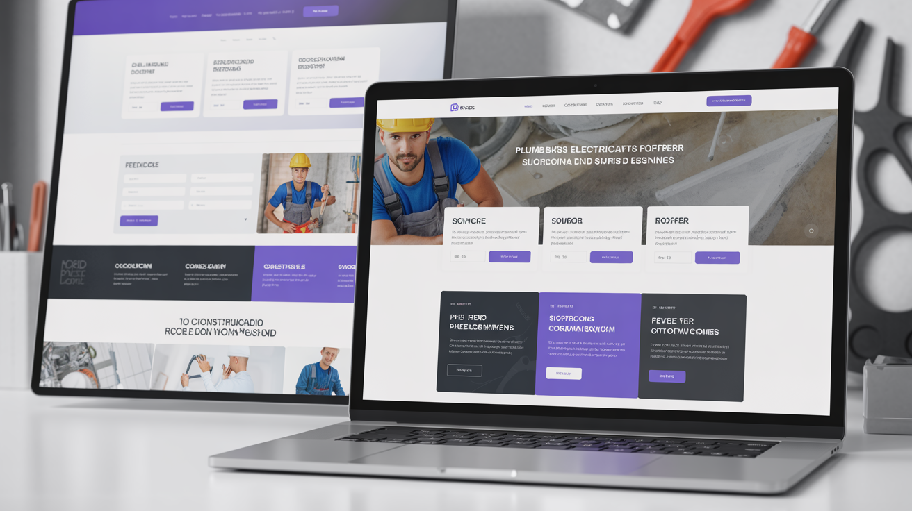
At Silver Spider Media, we've seen this firsthand across dozens of projects. When we redesigned the website for Right Choice Roofing Specialist with a mobile-first approach, their mobile traffic increased by 180% within three months. More importantly, mobile enquiries grew by 350% because the new design made it incredibly easy for potential customers to get in touch.
Get Your Free Web Design Quote optimised for mobile users.
2. Google Rankings Depend on It
Google's algorithm now prioritises mobile-friendly websites. If your site doesn't perform well on mobile devices, you'll struggle to rank well in search results—even on desktop searches. This is called "mobile-first indexing," and it's non-negotiable for modern SEO.
Key Mobile Ranking Factors:
- Mobile page speed
- Mobile usability
- Responsive design implementation
- Touch-friendly navigation
- Readable text without zooming
- Proper viewport configuration
3. Conversion Rates Improve
A mobile-optimised website doesn't just attract more visitors—it converts them at higher rates. When users can easily navigate, read content, and take action on their mobile devices, they're more likely to complete desired actions like making purchases, submitting enquiries, or calling your business.
Conversion Impact:
- Mobile-optimised websites convert 160% better than non-optimised sites
- 67% of users are more likely to buy from mobile-friendly sites
- 74% of users are more likely to return to mobile-friendly sites
4. Competitive Advantage
Despite the overwhelming evidence, many businesses still have websites that work poorly on mobile devices. By implementing mobile-first design, you gain an immediate competitive advantage in your market.
When we redesigned the website for Eden Gardens NI with mobile-first principles, they reported that potential clients frequently mentioned how easy their website was to use on phones compared to competitors. This perception of professionalism and modernity directly contributed to winning higher-value contracts.
Mobile-First Design Principles
Creating an effective mobile-first website requires following proven design principles:
1. Simplified Navigation
Mobile screens have limited space, so navigation must be streamlined and intuitive.
Best Practices:
- Hamburger menus for main navigation
- Prominent search functionality
- Sticky navigation that stays accessible
- Clear, tappable menu items
- Logical information architecture
- Breadcrumb trails for complex sites
What to Avoid:
- Dropdown menus with multiple levels
- Tiny, hard-to-tap navigation links
- Hidden or unclear navigation
- Excessive menu options
2. Touch-Friendly Interface
Mobile users interact with websites through touch, not mouse clicks. This fundamental difference requires specific design considerations.
Touch Target Requirements:
- Buttons should be at least 48x48 pixels
- Adequate spacing between tap targets (at least 8 pixels)
- Clear visual feedback when elements are tapped
- Swipe-friendly galleries and carousels
- Easy-to-use form inputs
Real-World Implementation: When designing Premium CNC Cut & Design's mobile website, we made all buttons substantially larger, increased spacing between links, and implemented swipe functionality for their product galleries. The result was a 45% decrease in mis-taps and frustrated users.
3. Readable Typography
Text must be easily readable without pinching and zooming.
Typography Guidelines:
- Minimum 16px font size for body text
- Clear, sans-serif fonts for readability
- Adequate line height (1.5-1.6 for body text)
- Sufficient contrast between text and background
- Short line lengths (50-60 characters per line)
- Larger headings for clear hierarchy
4. Optimised Images and Media
Images are often the biggest culprit in slow mobile load times.
Image Optimisation:
- Responsive images that scale to screen size
- Modern formats like WebP for smaller file sizes
- Lazy loading for images below the fold
- Compressed images without quality loss
- Appropriate dimensions (no massive images scaled down with CSS)
Video Considerations:
- User-initiated playback (no auto-play)
- Optimised video files
- Alternative image placeholders
- Closed captions for accessibility
5. Mobile Page Speed
Mobile users are even more impatient than desktop users. Every second of delay dramatically increases bounce rates.
Speed Optimisation Techniques:
- Minimised code (CSS, JavaScript)
- Browser caching
- Content Delivery Networks (CDNs)
- Reduced server response times
- Elimination of render-blocking resources
- Optimised fonts
- Reduced number of plugins
When we rebuilt LA Engineering Northwest's website with mobile-first performance optimisation, we reduced their mobile page load time from 9.7 seconds to 1.8 seconds. Their mobile bounce rate dropped from 78% to 32%, and mobile session duration increased by 240%.
View Our Portfolio to see examples of fast, mobile-optimised websites.
Common Mobile Design Mistakes to Avoid
Even with good intentions, many businesses make critical mobile design mistakes:
Mistake 1: Non-Responsive Design
Some websites still aren't responsive at all, requiring users to pinch and zoom to navigate. This is unacceptable in 2026.
The Fix: Implement fully responsive design that automatically adapts to any screen size.
Mistake 2: Intrusive Pop-ups
Pop-ups that cover the entire mobile screen frustrate users and can actually harm your Google rankings.
The Fix: Use subtle, easy-to-dismiss pop-ups or better yet, incorporate your calls-to-action naturally within the content.
Mistake 3: Unoptimised Forms
Long, complicated forms are frustrating on mobile devices.
The Fix:
- Keep forms as short as possible
- Use appropriate input types (number pad for phone numbers, email keyboard for email addresses)
- Implement auto-fill support
- Use large, tappable input fields
- Show clear error messages
- Consider multi-step forms for complex data collection
Mistake 4: Tiny Text and Links
Text that's too small or links that are too close together make for a frustrating user experience.
The Fix: Follow the typography and touch target guidelines mentioned earlier.
Mistake 5: Horizontal Scrolling
Requiring users to scroll sideways to see content is disorienting and annoying.
The Fix: Ensure all content fits within the screen width, using vertical scrolling only.
Mobile-First Content Strategy
Mobile-first design isn't just about layout and functionality—it's also about content strategy.
Content Principles for Mobile
1. Front-Load Important Information
Mobile users scan quickly. Put the most important information first.
- Lead with the value proposition
- Use descriptive headlines
- Include immediate calls-to-action
- Save detailed information for below the fold
2. Break Content into Digestible Chunks
Long paragraphs are hard to read on small screens.
- Use short paragraphs (2-3 sentences)
- Incorporate bullet points and lists
- Use descriptive subheadings
- Include visual breaks (images, whitespace)
3. Prioritise Visual Content
Images, icons, and graphics communicate quickly and effectively on mobile.
- Use relevant, high-quality images
- Incorporate icons to convey information quickly
- Consider infographics for complex data
- Implement image galleries thoughtfully
4. Simplify Calls-to-Action
Mobile CTAs need to be clear, prominent, and easy to complete.
- Use contrasting colours for CTA buttons
- Make buttons large and tappable
- Use action-oriented language
- Reduce form fields to minimum
- Implement click-to-call buttons for phone numbers
Testing Mobile Performance
Once your mobile-first website is built, thorough testing is essential.
Testing Tools
Google Mobile-Friendly Test: Free tool that analyses your website and identifies mobile usability issues.
Google PageSpeed Insights: Tests mobile performance and provides specific recommendations for improvement.
Real Device Testing: Test on actual smartphones and tablets across different:
- Operating systems (iOS, Android)
- Screen sizes (phones, phablets, tablets)
- Browsers (Chrome, Safari, Firefox)
- Network speeds (4G, 5G, slower connections)
User Testing: Have real users test your mobile site and provide feedback about:
- Navigation ease
- Content readability
- Form completion
- Page speed perception
- Overall experience
The Business Case for Mobile-First
Investing in mobile-first design delivers measurable business results:
Case Study: Bourne Accounting
Before mobile-first redesign:
- 65% mobile traffic but only 12% mobile conversions
- Mobile bounce rate: 81%
- Average mobile session: 24 seconds
After mobile-first redesign:
- Mobile conversions increased to 38%
- Mobile bounce rate decreased to 34%
- Average mobile session: 2 minutes 47 seconds
- Overall enquiries increased by 125%
Return on Investment: Most businesses see their mobile-first investment returned within 3-6 months through:
- Increased mobile traffic from better Google rankings
- Higher conversion rates from improved usability
- Reduced development costs (one responsive site vs. separate mobile site)
- Improved brand perception
- Competitive advantage in their market
Mobile-First and Progressive Web Apps
The evolution of mobile-first design leads naturally to Progressive Web Apps (PWAs)—websites that function like native mobile apps.
PWA Benefits:
- Offline functionality
- Push notifications
- Home screen installation
- App-like experience
- Faster performance
- Lower development costs than separate iOS and Android apps
Whilst PWAs aren't necessary for every business, they represent the future of mobile web experiences, particularly for e-commerce and service-based businesses with frequent customer interactions.
Future-Proofing Your Mobile Presence
Mobile technology continues to evolve. Future-proof your website by:
1. Using Modern Web Standards Build with current HTML5, CSS3, and JavaScript standards that will continue to be supported.
2. Implementing Responsive Design True responsive design adapts to any screen size, not just today's common sizes.
3. Focusing on Performance Fast websites will always have an advantage, regardless of future technology changes.
4. Prioritising Accessibility Accessible websites work better for everyone, including future assistive technologies.
5. Building with Scalability in Mind Choose platforms and architectures that can grow and evolve with your business.
Making the Move to Mobile-First
If your current website isn't mobile-first, you're leaving money on the table every single day. The transition doesn't have to be overwhelming:
Step 1: Audit Your Current Mobile Performance Use Google's Mobile-Friendly Test and PageSpeed Insights to understand current issues.
Step 2: Prioritise Quick Wins Some improvements (like image optimisation) can be implemented quickly for immediate benefits.
Step 3: Plan Your Redesign Work with professionals who understand mobile-first design principles and can guide you through the process.
Step 4: Implement and Test Build your new mobile-first website with thorough testing before launch.
Step 5: Monitor and Optimise Use analytics to track mobile performance and continuously improve.
Why Choose Silver Spider Media
At Silver Spider Media, mobile-first design is our standard approach for every website we build. With over 60 successful projects across the UK and Ireland, we've proven that mobile-first design delivers results.
Our Mobile-First Process:
- Strategic planning based on your mobile users' needs
- Responsive design that works beautifully on all devices
- Performance optimisation for fast mobile loading
- Comprehensive testing across devices and browsers
- Ongoing support to maintain optimal mobile performance
We don't just build websites that work on mobile—we build websites that excel on mobile, driving traffic, engagement, and conversions from the majority of your visitors.
Take Action Today
Don't let a poor mobile experience cost your business any more opportunities. Whether you need a complete redesign or want to optimise your existing website for mobile users, we're here to help.
Next Steps:
-
Get Your Free Mobile-First Quote: Our interactive calculator provides instant pricing for mobile-optimised web design.
-
See Mobile-First Examples: Browse our portfolio of responsive, mobile-optimised websites across various industries.
-
Book a Free Consultation: Discuss your specific mobile challenges and learn how we can help.
The mobile revolution isn't coming—it's already here. Make sure your business is ready to meet your customers wherever they are, on whatever device they're using.
Silver Spider Media specialises in mobile-first web design for businesses across the UK and Ireland. Our proven approach ensures your website delivers exceptional experiences on all devices, driving traffic, engagement, and conversions. Contact us today to transform your mobile presence.
Ready to Transform Your Business?
Join hundreds of successful businesses across the UK & Ireland who trust Silver Spider Media for their digital presence. Get your personalised quote today.
Our Web Design Services
Discover how we can help transform your online presence with our comprehensive digital solutions:
See These Strategies in Action
Check out how we've implemented these web design principles for real businesses:
Real results from our portfolio
Real results from our portfolio
Real results from our portfolio
Real results from our portfolio
Real results from our portfolio
Ready to Transform Your Online Presence?
Get a free, personalised quote in just 5 minutes. See exactly what your website will cost—no obligation, no surprises.