Why Mobile-First Web Design Matters for Service Businesses
With over 70% of local searches happening on mobile devices, discover why mobile-first design is essential for plumbers, electricians, and other service businesses.
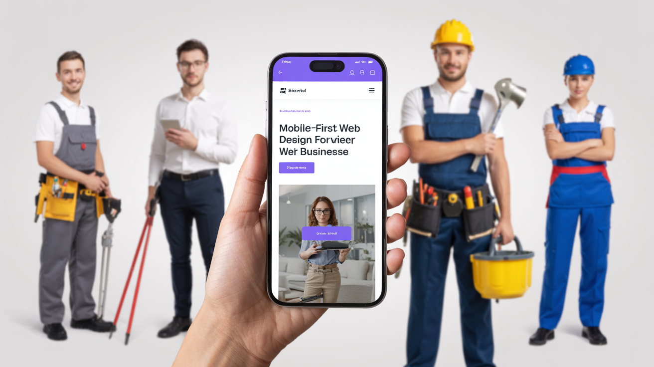
Why Mobile-First Web Design Matters for Service Businesses
Picture this: a homeowner discovers their boiler has broken down on a cold January morning. They grab their phone and search "emergency plumber near me." Within seconds, they're scrolling through results, looking for someone who can help immediately. If your website doesn't work perfectly on that phone, you've lost the job before they even see your phone number.
This scenario plays out thousands of times daily across the UK and Ireland. For service businesses—plumbers, electricians, roofers, landscapers, and others—mobile-first design isn't just a technical consideration. It's the difference between winning and losing customers.
The Mobile Reality for Local Searches
The statistics tell a compelling story:
- 70%+ of local searches happen on mobile devices
- 88% of mobile local searches result in a call or visit within 24 hours
- 57% of users won't recommend a business with a poor mobile site
- 53% of mobile users abandon sites that take over 3 seconds to load
For service businesses, these numbers are even more stark. When someone has a plumbing emergency or needs an urgent repair, they're almost certainly on their phone. They need to find help fast, and they won't wait for a slow or clunky website.
What Mobile-First Actually Means
"Mobile-first" doesn't just mean your website shrinks to fit a phone screen. It means designing for mobile users first, then scaling up to larger screens. This approach ensures:
Priority Content First
On a small screen, there's no room for fluff. Mobile-first design forces you to prioritise what matters most:
- Your phone number (tap-to-call)
- Your services
- Your coverage area
- How to get a quote
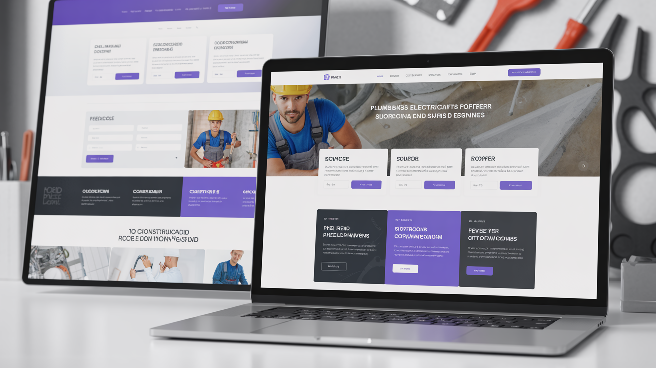
When we designed the website for CK Plumbing and Maintenance, their emergency phone number is visible within seconds on any device. There's no scrolling required to find help.
Touch-Friendly Navigation
Mobile users tap with their fingers, not click with a mouse. Buttons need to be large enough to tap accurately. Menus need to work intuitively. Forms need to be simple enough to complete with thumbs.
Fast Loading
Mobile connections vary from lightning-fast 5G to patchy 3G. Mobile-first design minimises file sizes, optimises images, and ensures your site loads quickly even on slower connections.
Readable Without Zooming
Text needs to be legible without pinching and zooming. This means appropriate font sizes, proper spacing, and layouts that work on smaller screens.
The Impact on Your Business
More Enquiries
A mobile-optimised website converts better. When customers can easily tap to call or fill out a contact form on their phone, they're more likely to actually do it.
Sebastian The Plumber's website is designed for the customer who needs help now. The call button is prominent, the contact form is simple, and the site loads in under 2 seconds.
Better Search Rankings
Google uses mobile-first indexing, meaning it primarily uses the mobile version of your site for ranking decisions. A poor mobile experience directly hurts your visibility in search results.
Improved User Experience
When customers can easily navigate your site, find information, and contact you, they form a positive impression of your business before you've even spoken to them.
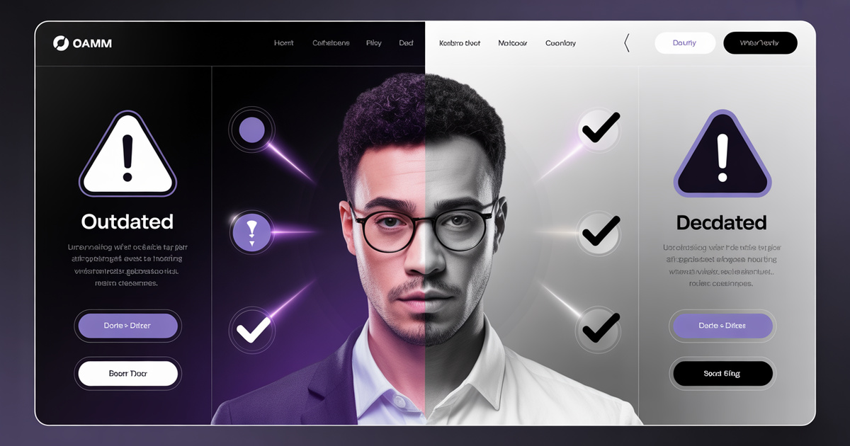
Competitive Advantage
Many trade businesses still have outdated websites that don't work well on mobile. Having a genuinely mobile-friendly site immediately sets you apart from competitors with poor digital presence.
Common Mobile Design Problems
Tiny Text
If users need to zoom in to read your content, you've already failed. Text should be at least 16 pixels and properly scaled for different devices.
Unclickable Elements
Phone numbers that aren't linked for tap-to-call are a missed opportunity. Buttons placed too close together cause frustration. Forms with tiny input fields are impossible to complete.
Slow Loading
Large images that haven't been optimised, heavy scripts, and poor hosting all contribute to slow load times. Every second of delay increases bounce rates.
Horizontal Scrolling
Nothing says "this site wasn't designed for mobile" like having to scroll left and right to see content. Mobile sites should flow vertically with no horizontal scrolling.
Pop-ups and Interstitials
Those "sign up for our newsletter" pop-ups that cover the entire screen? They're especially annoying on mobile and can hurt your search rankings.
What Good Mobile Design Looks Like
Clear Visual Hierarchy
The most important elements (contact information, main services) are visible without scrolling. Secondary information is organised logically below.
Thumb-Friendly Design
Important actions are placed within easy reach of thumbs. The bottom of the screen is often more accessible than the top on large phones.
Simplified Navigation
Instead of complex menus with multiple levels, mobile sites use hamburger menus, clear categories, and straightforward navigation paths.
Optimised Images
Professional photos of your work are essential, but they need to be properly optimised for fast loading without sacrificing quality.
Prominent Contact Options
Tap-to-call buttons, visible phone numbers, and simple contact forms make it easy for mobile users to reach you.
Testing Your Current Site
Want to know how your current website performs on mobile? Here's a simple test:
- Grab your phone and visit your website
- Time how long it takes to load (3 seconds is the maximum)
- Can you read the text without zooming?
- Try to call - is the phone number clickable?
- Fill out your contact form - is it easy on mobile?
- Navigate your site - can you find everything easily?
You can also use Google's free Mobile-Friendly Test at search.google.com/test/mobile-friendly to get a technical assessment.
The Mobile-First Design Process
When we build mobile-first websites at Silver Spider Media, we follow a structured process:
1. Content Strategy
We identify what information mobile users need most urgently and ensure it's immediately accessible. For emergency services, that's contact information. For considered purchases, it might be portfolio work or testimonials.
2. Wireframing for Mobile
We design the mobile layout first, ensuring everything works perfectly on the smallest screens before considering desktop.
3. Progressive Enhancement
Once mobile is perfected, we scale up to larger screens, adding design elements that enhance the experience without compromising mobile performance.
4. Performance Optimisation
We optimise every image, minify code, and leverage caching to ensure fast loading on all devices and connection speeds.
5. Testing Across Devices
We test on multiple devices and screen sizes to ensure consistent performance everywhere.
Making the Switch
If your current website doesn't work well on mobile, you have options:
Quick Fixes
Some issues can be addressed through responsive design updates to your existing site. This works if your underlying structure is sound.
Fresh Start
Often, a complete rebuild is the most effective solution. Modern websites are built mobile-first from the ground up, ensuring optimal performance.
Real Results
The businesses we work with see tangible improvements when they switch to mobile-first design:
- Millington & Sons Roofing: Simplified emergency contact process leads to faster response times
- OpenPlan Homes: Professional portfolio display that works beautifully on all devices
- Simpsons Jandu Joinery: Mobile-friendly gallery showcasing bespoke craftsmanship
The Bottom Line
In 2026 and beyond, mobile-first design isn't optional for service businesses—it's essential. Your competitors who've invested in mobile-friendly websites are capturing the customers you're missing. Every day with a poor mobile experience is a day of lost opportunities.
Ready to transform your mobile presence? Get your free quote and discover how a mobile-first website can help you capture more customers and grow your business.
Ready to Transform Your Business?
Join hundreds of successful businesses across the UK & Ireland who trust Silver Spider Media for their digital presence. Get your personalised quote today.
Our Web Design Services
Discover how we can help transform your online presence with our comprehensive digital solutions:
See These Strategies in Action
Check out how we've implemented these web design principles for real businesses:
Real results from our portfolio
Real results from our portfolio
Real results from our portfolio
Real results from our portfolio
Ready to Transform Your Online Presence?
Get a free, personalised quote in just 5 minutes. See exactly what your website will cost—no obligation, no surprises.